It’s hard to imagine politics influencing design and color trends but then no one imagined the division this past election would elicit. Let’s face it, we are living in very tense and stressful times. Our solution to this stress is retreating into our sanctuary – our home – to regenerate and find balance.
So, it’s not too hard to see the 2017 Color of the year for both Pantone and Sherwin Williams would elicit the feelings of warmth, hopefulness and new beginnings. However, these two choices, Greenery (Pantone) and Poised Taupe (Sherwin Williams) couldn’t be further away on the color spectrum.
Pantone’s Greenery is reminiscent of spring – new plants sprouting, the promise of a fresh new start. It is a yellow green that connects to nature. It is refreshing and as Pantone stated, “it is nature’s neutral”.
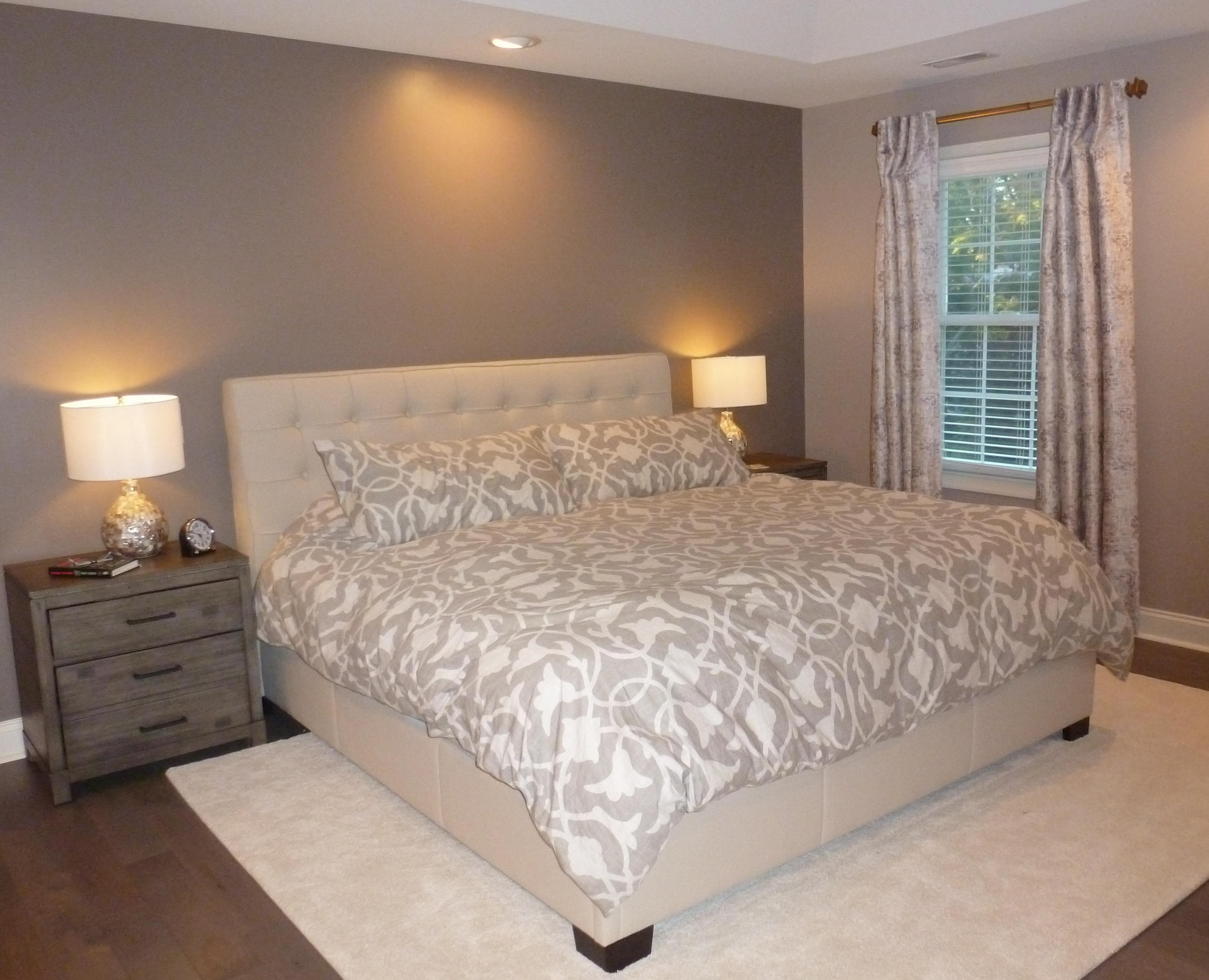
Sherwin Williams’s Poised Taupe is a beautiful color that feels aged and weathered. It is an earthy brown mixed with gray that creates coziness and warmth. It is a calm, toasty color that allows the stress of the world to melt away the minute we walk into our home.
Both colors make us feel restored, revitalized. And in the uncertainty of these times, isn’t that just what we need to help us strike a balance in our lives?


