Political Climate influences 2017 Colors of the Year
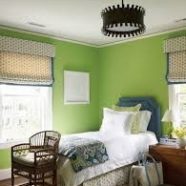
It’s hard to imagine politics influencing design and color trends but then no one imagined the division this past election would elicit. Let’s face it, we are living in very tense and stressful times. Our solution to this stress is retreating into our sanctuary – our home – to regenerate and find balance. So, it’s not too hard to see the 2017 Color of the year for both Pantone and Sherwin Williams would elicit the feelings of warmth, hopefulness and new beginnings. However, these two choices, Greenery (Pantone) and Poised Taupe (Sherwin Williams) couldn’t be further away on the color...
Read MoreGender Blur- You bet! Pantone’s Color of the Year
For the first time, Pantone has deviated from tradition and selected two colors as Color of the Year – Rose Quartz and Serenity. It is a much softer take on color than last year’s rich choice of Marsala. The delicate pink and tranquil blue creates a balance between the warmth of the rose tone and the coolness of blue. It also challenges the traditional perceptions of color pairing. Regardless, these colors create a sense of calmness and relaxation. The choice reflects many global changes in fashion with gender blurring designs and a younger generation that is less concerned about past social...
Read More2016 Interior Design Trends
I was recently asked by a local design magazine to contribute to an article on the 2016 design trends. As I am thinking about the latest in design, I thought it was a good time to share what I see happening for 2016. – The mix of rustic and modern continues to grow in popularity especially among young urban families. For example, a feature wall of reclaimed wood combined in a space with sleek modern elements is oh so fabulous. – Statement lighting is all the rage. Oversized, rustic Pendent lighting, artisan chandeliers, if it is unique and/or up cycled it is trending. –...
Read MoreLet’s uncork Pantone’s New Color of the Year!
Marsala is Pantone’s 2015 Color of the Year! What a warm and earthy change from the recent previous years’ color selections! Marsala, with its red-brown tones, embodies sophistication and style. It is both dramatic and yet down to earth and will appeal to both men and women. Marsala pairs beautifully with neutrals like grays, blacks and golds. It is a complex color that can be grounding and practical when paired with gray or blue but luxurious when paired with gold. To create a more modern look, try pairing it with mint green or a hot pink. Here are a few suggestions to incorporate...
Read MoreSmall Bath is Big on Style!
I’m really happy with the final result of this small bathroom update. Small baths are tough – how do you maximize minimal space? Well, with this bath we chose a neutral color palette, elongated tile designs and glass to make the space feel bigger. We selected 6” X 24” gray ceramic floor tile and laid it vertical to the tub to create an illusion of a longer room. We then added a 12” wide band of decorative tile in the center of the tube surround to draw the eye upward. Finally, we added an updated vanity with quartz counter, updated lighting and – wow- a small bath that’s big on style! ...
Read MoreUniversity of Delaware – Theta House Install
Updated Public Space I had the pleasure of working with NYC Interior Designer, Jen Coleman this week to complete the decorating project for the Kappa Alpha Theta House at the University of Delaware. We redecorated the public rooms of the sorority house – the final reveal – warm, tasteful, gorgeous! What do you think?
Read More


